ABSTRACT
Introduction: The amount of quality data continues to increase. To help prioritise resources for quality improvement, managers need thorough reviews to help them decide which indicators are most important to improve. The reality is that data is presented in piles of reports and hundreds of tables and graphs that are very time-consuming to go through and that rarely result in a simple comprehensive overview. This paper presents an empirically tested tool to create a simple overview of complex quality data.
Methodology: Data comes from a questionnaire-based patient satisfaction survey of 13,129 patients and 1,589 staff members at Ribe County Hospital. A method is described: how to use colour coding in order to present the results for 16 indicators, measured both by patients and three staff member groups, for 28 departments and 46 ambulatories, in one page.
Results : Data for mean satisfaction scores on all questions are shown for each department in a core map. Aggregated departmental mean satisfaction scores are then calculated, as are hospital mean scores for each question. The same is done for staff members' evaluation and for outpatient care. Few problems are universal and most of the problematic scores are related to a minority of departments, calling for local activities to improve quality. Diversity seems to be the rule.
Conclusions : The SurveillanceMapper-tool proved effective for handling the complexity of quality measures. It is easy to translate hundreds of graphs and tables into the SurveillanceMapper-tool format. The method facilitates easy spotting areas for quality improvements and evaluating the results of intervention.
One of the major intentions of quality management systems is to create an overview for the management review so they can decide where to prioritise resources for quality improvement as well as measure when standards are fulfilled [1-4]. In reality, managers are confronted with piles of different reports on budgets and organisational quality, on the many national or local clinical databases, benchmarks, patient safety issues, accreditation reviews and patient satisfaction surveys, to name a few. How can they obtain the overview necessary for systematically prioritising which indicators should be improved? Based on experience from a patient and staff satisfaction survey, this paper presents an empirically developed tool to give a simple stratified hierarchical overview of complex data that can be easily acted upon.
Material and method
A questionnaire was used to investigate the experiences of patients visiting the regional county hospital in the month of May 2005. The survey included patients from all 28 departments and 46 outpatient clinics. The majority of the questions were taken from the biannual national survey questionnaire [5]. Additionally, we wanted to compare staff expectations of patient evaluation with the actual patient scores. This paper will only focus on the method for presenting a simple overview of complex data.
The SurveillanceMapper method starts with a table in which the mean scores for each question and department are calculated. A colour code is subsequently applied to adjacent ranges of scores. In the example of our patient survey, green means that less than 10% are dissatisfied, and black is used if it concerns more than half the patients. The resulting colour code is then applied to the grid for that specific department and question. Repeating this for all departments and questions results in a comprehensive overview of several quality issues (in our example 16 items), stratified by department, for the entire hospital ( Figure 1 ).
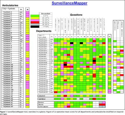
This is called the core map. At the right of the core map, an aggregated departmental score of weighed means is calculated, which is shown in the Pt-column. The same was done for the data about how staff members believe that patients would rank the department, but only the aggregated scores are shown in the figure. Since staff members in small departments are often affiliated to a larger one, it was not possible to express their views on all departments (white code). At the left of the core map each outpatient clinic is ranked in the same way as the departments, but since staff members are primarily employed in departments we could not affiliate them to specific ambulatories, and therefore only the patient scores are shown.
The vertical mean score at the bottom expresses the aggregated influence of each question at hospital level. However, during the calculation of hospital mean scores it became evident that results from large departments would obscure the results from small departments. Therefore co-operative thinking was used, meaning that each department score contributed equally to the vertical mean score. Since the majority of the questions were also used for outpatient clinics, similar calculations were made for them, also shown at the bottom of the figure.
At this level, departments are anonymised in the figure, and the number of patients has been altered. Otherwise it would be too easy to point out who is who. However, the top management and each department are aware of the departments' true identities.
The questionnaires were scanned electronically using the software Eyes & Hands for translation and interpretation. Stata 9.0 was used for data cleaning, analysis and generating colour codes for mapping.
The survey is approved by the national registration authority.
Results
The populations consisted of 11,282 outpatients and 1,843 admitted patients plus 1,589 staff members. The response rate was 48% for both outpatients and admitted patients and 65% for the staff members. To ensure confidentiality, only departments with more than five patients or staff group members responding and ambulatories with more than nine patients were included. Substantial variation in quality is seen from this figure, but it is also evident that there are patterns to be found. Some departments are regarded better than others by the patients, which is in fair agreement with the staff evaluations. There are questions for which all departments are green, and they don't need the same focus in the future. Only a few questions are problematic for the bulk of departments, but these are attractive candidates for general hospital initiatives. However, for the majority of questions, improvements are only relevant for relatively few departments, and therefore require local initiatives.
Aggregated patient related quality data is shown at the right and at the bottom of the core map. Weighting was used to allow a reasonable amount of rebate. Differences in scores between patient and staff evaluations are illustrated, and there is a tendency that the least educated staff members express the most negative expectations of patient judgements.
Discussion
It is always difficult to present a complex message in a simple way. But good quality management requires a comprehensive overview of the need for quality improvements to be able to prioritise resources. Accounting is a widespread example of how complex information is aggregated to get such an overview, but it works only because it uses money as the common measure. This is why health economists develop methods to translate death and suffering into the common value of money [6, 7]. But a similar common currency for quality management in health care has not yet been developed. Data are therefore reported in numerous reports, making continuous up-to date overviews, a cumbersome task. Quality reporting systems are often based on graphical presentation, but it is technically impossible to show more than a few indicators in a single graph. Control charts are used to follow time trends from samples of single indicators, but are unable to show the complexity of multiple indicators [8]. Tables are probably still the most comprehensive tools for presentation of complex quantitative data. But they are difficult to grasp, and in large tables figures might easily be overseen. The SurveillanceMapper colour code is a way to translate tables with agreed standards of quality into maps that are easier to remember and recognise.
Many of the established Danish clinical quality databases confirm that differences between departments could easily be larger than differences between hospitals. One such example is from the national Good Medical Department survey, in which our hospital participated with eleven departments [9]. These results support the need for a tool that can show more than average scores for large departments. Still, focus is primarily on benchmarking between hospitals. In order to be able to benchmark hospitals, however, the national patient satisfaction survey only includes large departments. The consequence of these selection criteria is that three out of four departments in our hospital would not have their quality evaluated unless it is done by local surveys, which for many reasons are rarely done. This is a problem since our results show that large departments are not necessarily representative of smaller departments, and that small is not always good. Daily practice confirms that small departments significantly influence the reputation of the whole hospital among patients, staff and GP's. A proactive use of the mapping means that many things may also be learned from green or yellow departments.
Outpatients pay short visits and may only have a little experience to judge the quality of our hospital. But two thirds of our patients were outpatients, and because they make up the bulk of patient contacts today, they are the major carriers of our reputation. The SurveillanceMapper shows that their evaluation differs from that of admitted patients, and it supports the relevance, as shown in prior reports, of including outpatient care in quality surveys [10, 11].
Star rating is a highly relevant example of political demand for simple tools to compare overall quality among hospitals. But using a single star evaluation doesn't make sense [12]. If relevant aggregated subcategories of indicators were agreed upon, SurveillanceMapper could then be used to give a more comprehensive, yet still simple, comparison of quality in health care. The actual weights must be decided upon depending on the explicit context, professional judgement and available evidence base. Then, relevant aggregated scores can provide the management with an easy method for spotting potentials for quality improvements, and for directly going one step further to see which indicators are problematic.
However, although SurveillanceMapper might help to pinpoint where there is a quality problem, it doesn't provide a solution to the problem, and additional analysis is therefore needed before action is taken [13, 14]. A subsequent map could then show if interventions improved the quality.
Conclusion
We found that SurveillanceMapper did work well in practice for identifying potential improvement areas. However, it is too early to tell if it also substantially enhances the intervention and follow-up processes thus resulting in a faster fulfilment of the stated quality standards. The SurveillanceMapper-tool proved effective for handling the complexity of quality measures, including important variations among staff and patients and between departments and services. It is easy to translate hundreds of graphs and tables into the SurveillanceMapper-tool format. And it is very simple to understand both for professionals and patients.
References
- Hoyle D. ISO 9000 Quality Systems Handbook. Amsterdam: Elsevier, 2001.
- Oakland JS. Total Quality Management text with cases. Amsterdam: Elsevier, 2003.
- CEN European Committee for Standardization. Health services - Quality management systems - Guide for the use of EN ISO 9001:2000. Brussels: Final draft prCEN/TS 15224. 2005:1-64.
- Dansk Standard. Infection control in the health care sector - Requirements for the management system. v: DS 2450. 2001:1-32.
- Østerbye T, Gut R, Blæsbjerg C et al. Patienters oplevelser på landets sygehuse 2004. Spørgeskemaundersøgelse blandt 26,300 indlagte patienter. [Patient experiences from national hospitals 2004. Questionnaire survey among 26,300 admitted patients]. 2005:1-75 København, Enheden for Brugerundersøgelser. http://www.patientoplevelser.dk/log/medie/Rapporter/LPU_2004.pdf Accessed Sept./2007.
- Gafni A, Birch S. Searching for a common currency: Critical appraisal of the scientific basis underlying European harmonization of the measurement of Health Related Quality of Life (EuroQol). Health Policy 1993;23: 219-28.
- Headly B. An economic model of subjective well-being: integrating economic and psychological theories. Social Indicators Research 1993;28: 97-116.
- Katz JM, Green E. Managing quality. A guide to system-wide performance management in health care. St. Louis: Mosby, 1997.
- Den Gode Medicinske Afdeling. Tværsnitsundersøgelse 2005. [The Good Medical Department. Cross Sectional Survey 2005]. 2005; http://web. dgma.dk/?page=2255 Accessed Sept./2007.
- Patienters oplevelser. Spørgeskemaundersøgelse blandt 4.200 ambulante patienter i Roskilde Amt. [Patient Experiences. Questionnaire Survey among 4,200 Outpatients in Roskilde County]. 2002: 1-69 København: Enheden for Brugerundersøgelser. http://www.patientoplevelser.dk/log/ medie/Rapporter/Rosk2002_ambulant.pdf Accessed Sept./2007.
- Patienters oplevelse. Spørgeskemaundersøgelse blandt 14.900 ambulante patienter i Vejle Amt 2003/2004. [Patient Experiences. Questionnaire Survey among 14,900 Outpatients in Vejle County 2003/2004]. 2004: 1-112 København: Enheden for brugerundersøgelser. http://www.patientoplevelser.dk/log/medie/Rapporter/rapportvejle05.pdf Accessed Sept./2007.
- Barker RM, Pearce MS, Irving M. Star wars, NHS style. BMJ 2004;329: 107-9.
- Kaufman JS, Cooper RS. Seeking causal explanations in social epidemiology. Am J Epidemiol 1999;150:113-20.
- Tashakkori D, Teddlie C. Handbook of Mixed Methods in Social & Behavioural Research. London: Sage Publications, 2003